Once Once
Rebranding Concept Once Once
Overview
Once Once is an iconic Venezuelan brand with decades of existence, is one of the companies dedicated to the most famous candy category in the country. The project consisted of developing a proposal for a new branding.
We wanted to create a brand that would stand out in today’s times, but also maintain the traditional values and core features of Once Once products. We designed a logo that could be used as a seal (similar to what they did years ago) and integrated the brand in alphanumeric characters so that it could be used in any medium.
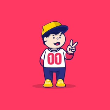
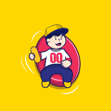
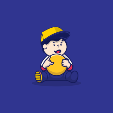
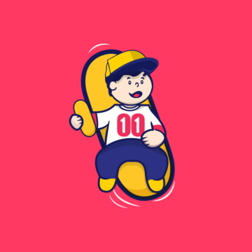
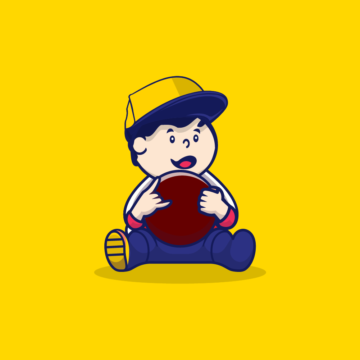
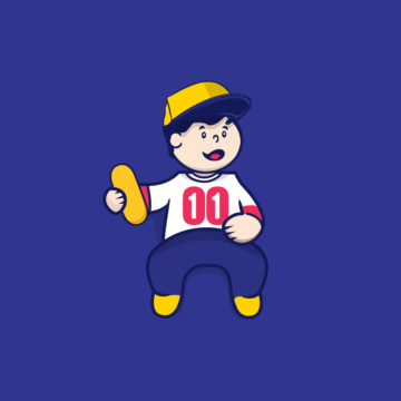
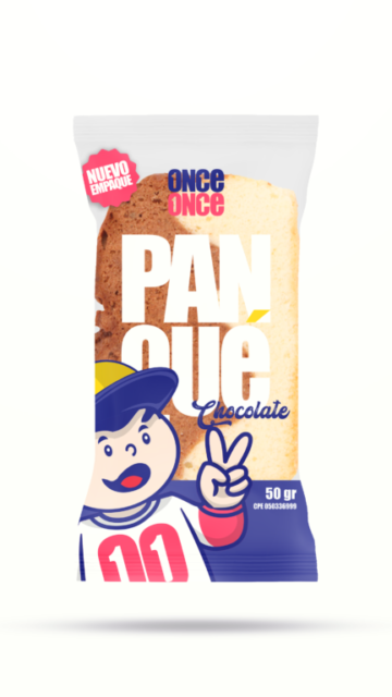
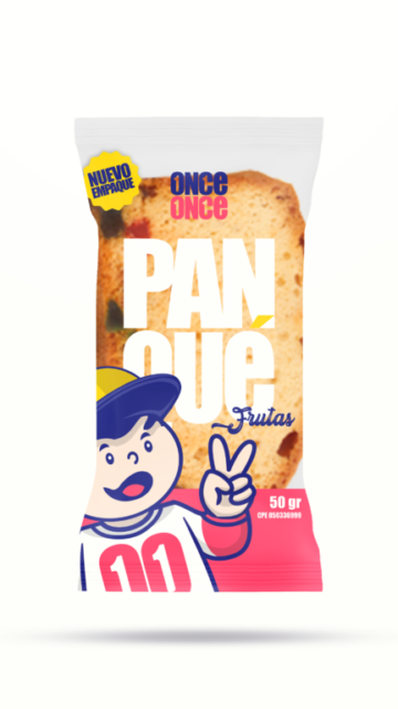
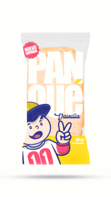
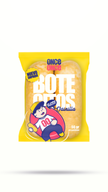
The main challenge was to create a unique visual language that would be easily recognizable by the Venezuelan public, and that would maintain all the elements of its identity (the Oncito character, the Once Once logo, the colors, and the spike), but that would show an evolution. For this reason, it was decided to create an “Oncito”, in the same illustration style, which transformed: it went from being a “baby” to being a child between 5 and 10 years old. We changed the old maternal cap for a current cap; the children’s clothing was replaced by pants and a long-sleeved shirt, and his personality had a more confident attitude of joy, enjoyment, and “good vibes”.
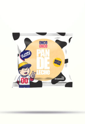
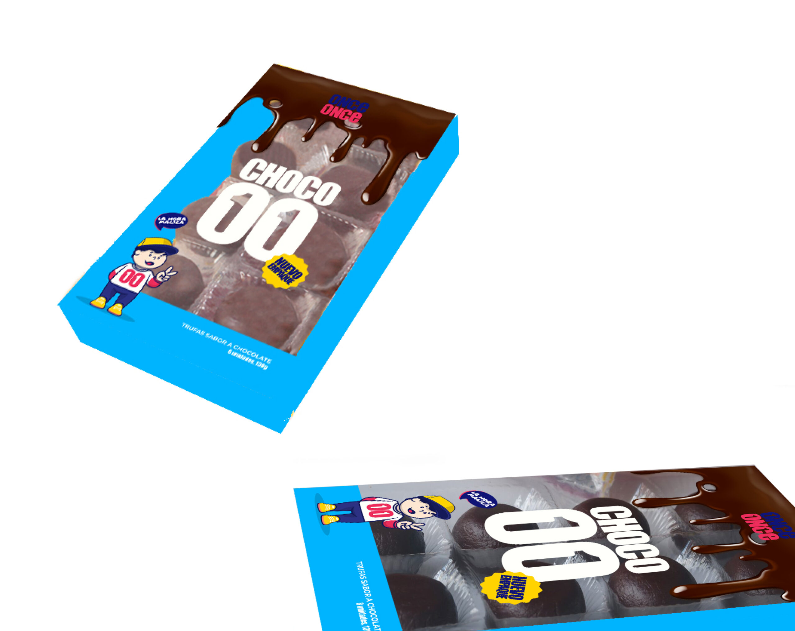
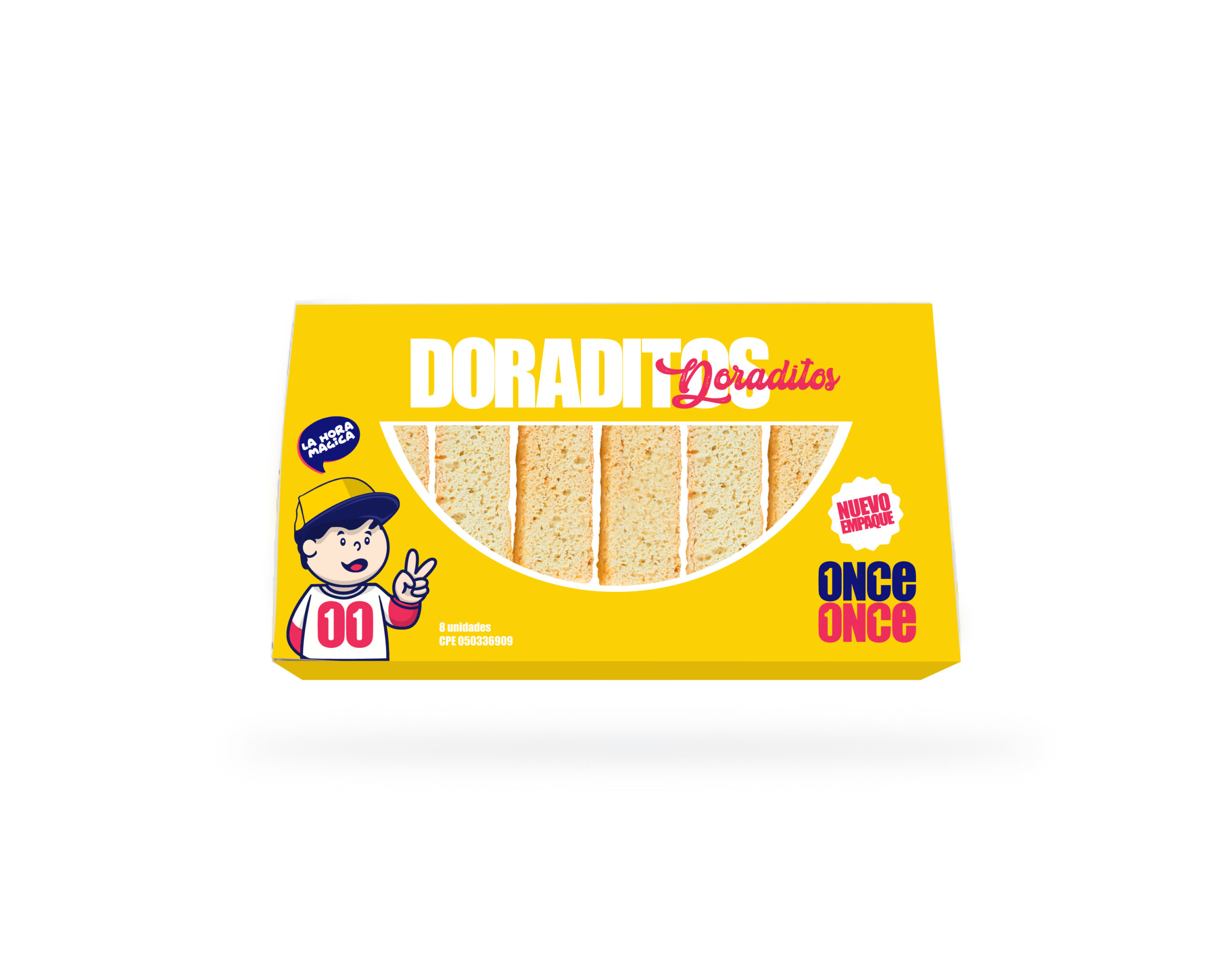
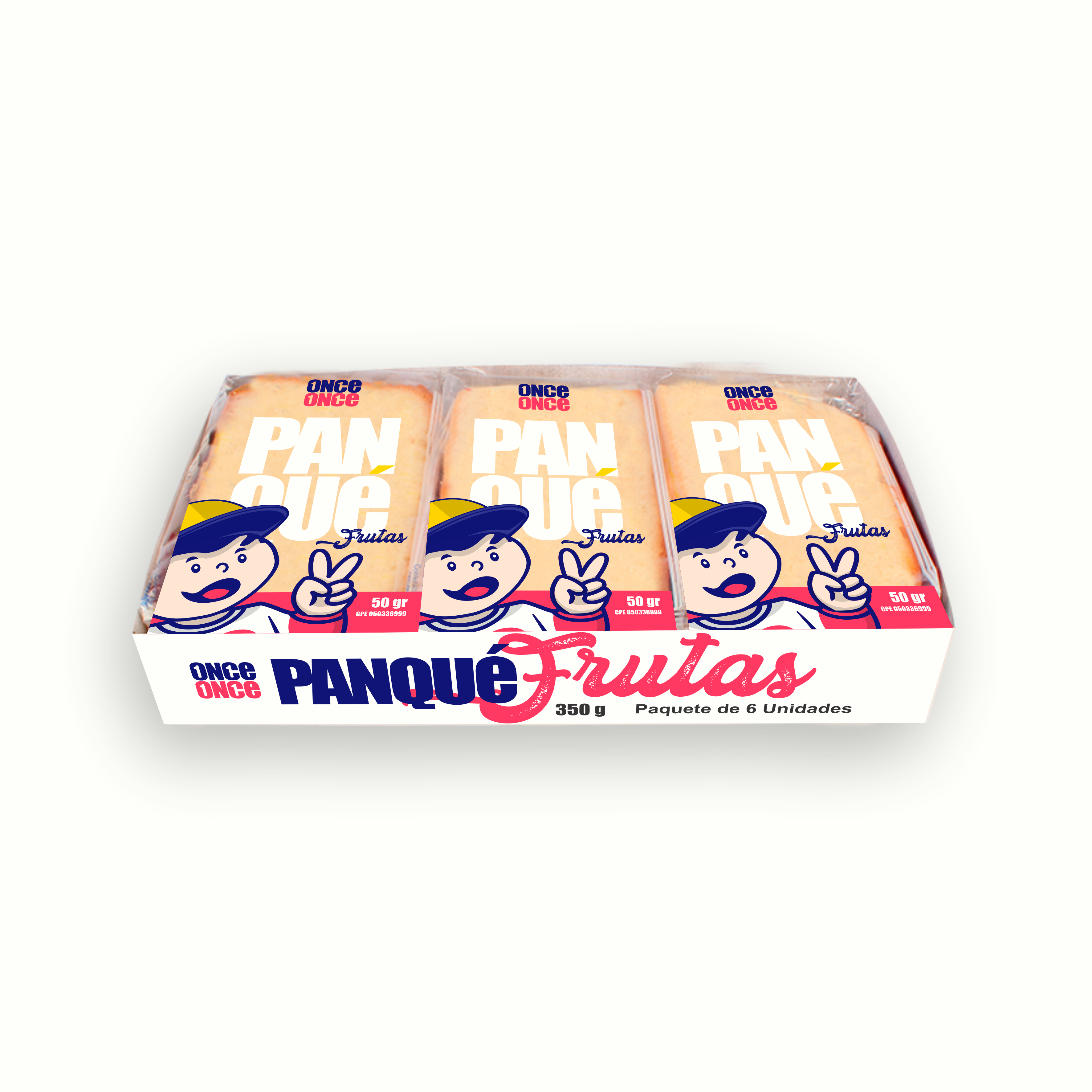
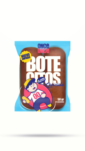
We designed the new Oncito in various poses, adapted according to the product.
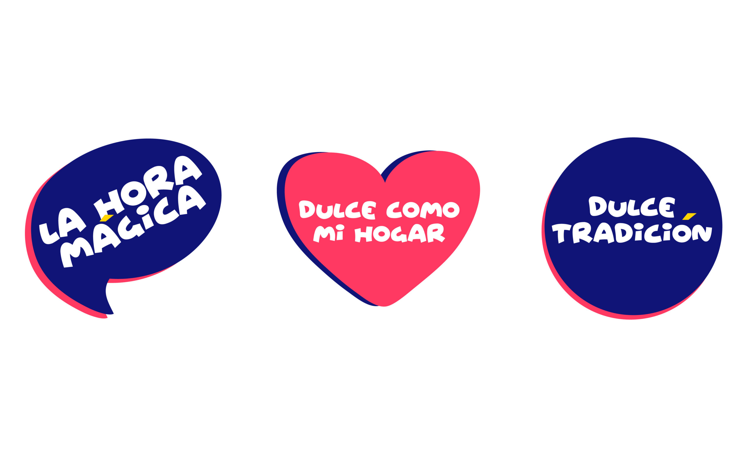
Packaging design
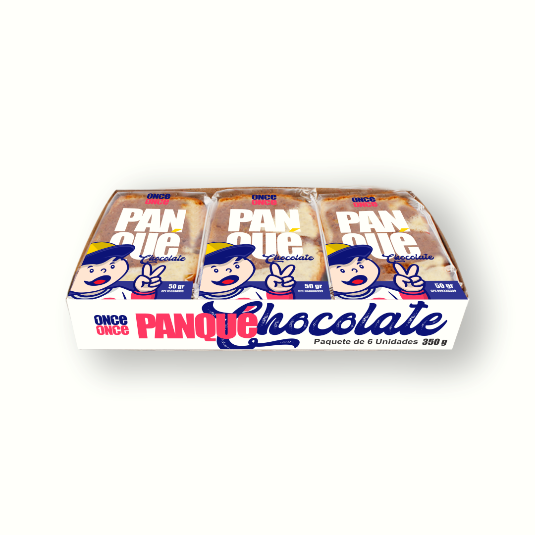
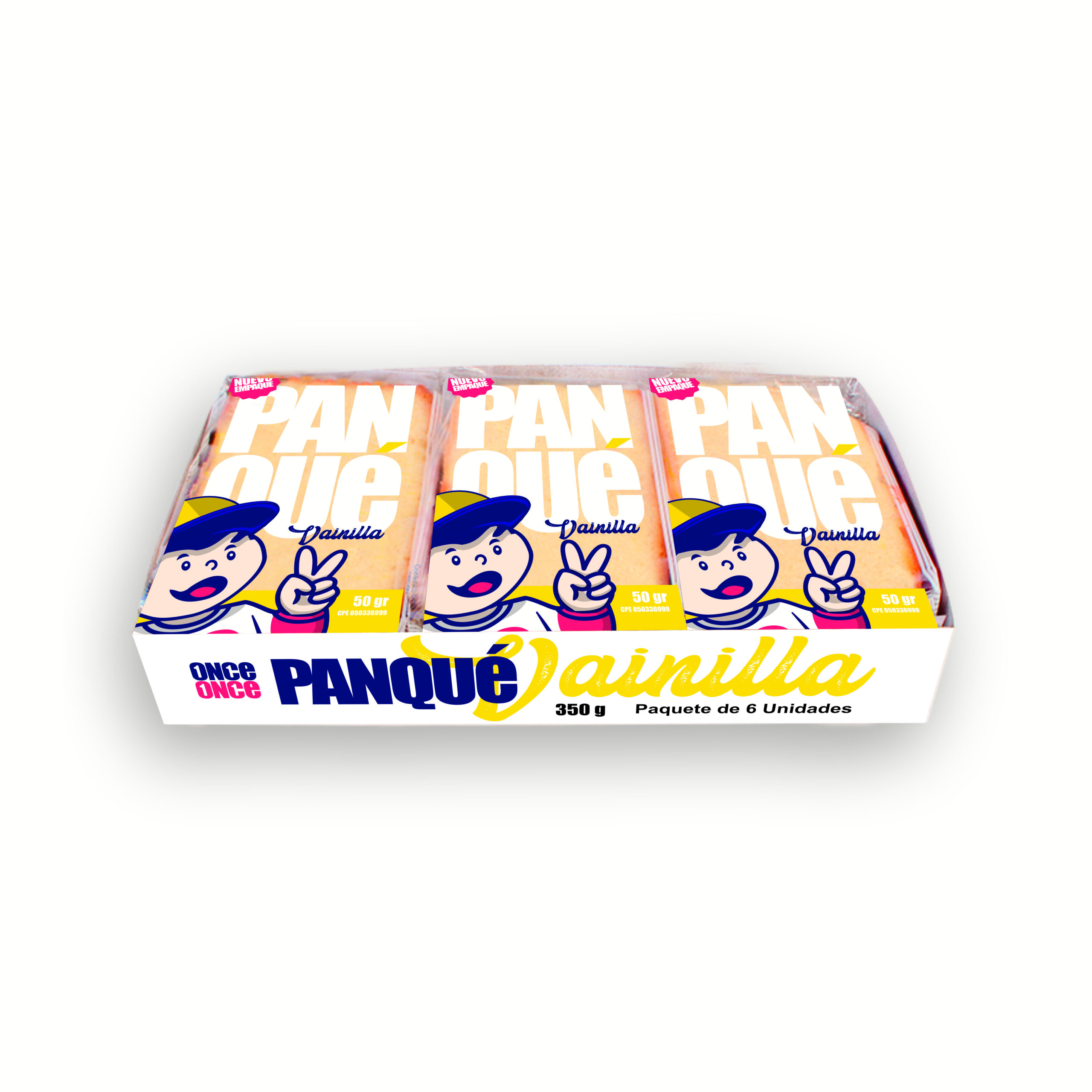
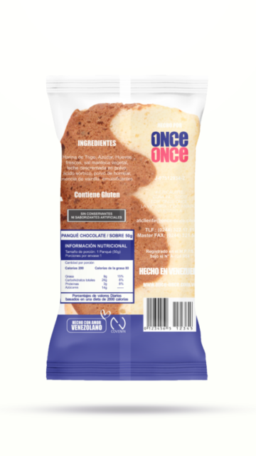
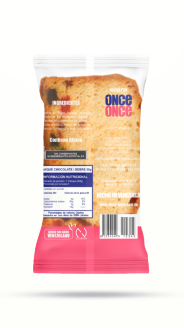
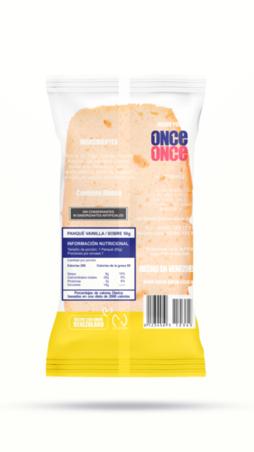
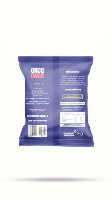
We also designed all the packaging for their products.
